

So blue for upvote, red for down and then an updated Sync logo.
I was against the change when I read this post, but now I have to say I love the ice blue color on the AMOLED black background. Nice.
Ah, so this is what it is! I was wondering why the volors were wrong. Why must every new platform change it?! At least I can change it back.
Can you give a mockup of the logo with red?
This would be nice!
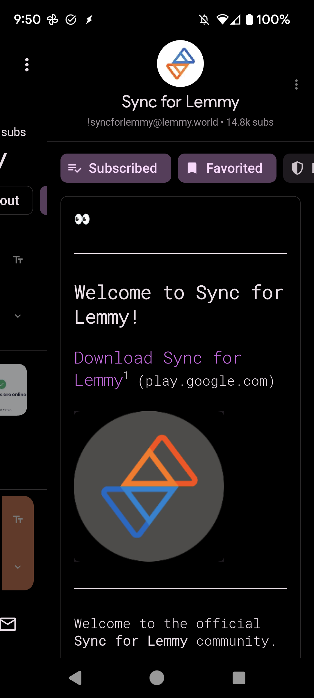
If you look at the “about” page for this community, the community avatar is blue=up and red=down, but a bit lower is the red=up and blue=down. That’s what I see, at least.
Edit:
Y E S
As long as the blue/red colors are different enough from the current colors, that’d make it a less confusing change. Even if the colors don’t change, I think it’s best to match Lemmy’s setup.
Yes
Yes
Yes, lemmy colours should be the default. Perhaps give an option in the settings for people that want the alternative colour scheme.
Test
Anyone know the color codes for the original vote colors? I tried color picking from the (old) logo, but that doesn’t look correct.Edit: I’m dumb. The swatches are right there.
Design language wise, it would make sense
Personally, I want a way to reverse the vote colours on the buttons…
I think this should be an option, but I’d also retain classic Sync up/down colours too for those who want to stay with it. I’m not sure I could ever get used to blue being an upvote, but I get why some might want it to.
I think they should. Would be nice if you could change the app icon and then the upvote/down vote colors and then give the option to reverse the upvote/down vote colors.
Bruh even google does’nt pull that shit . Is’nt ads in feed enough ? But i guess dev gotta eat and the feed ones alone doesn’t cut it my opinions are split in this matter.
It sounds reasonable, yes.