Honestly, its considered a hot-take but I do like minimalistic logos cause they are easier to recognize. Also they tend to better fit with the rest of the UI and products.
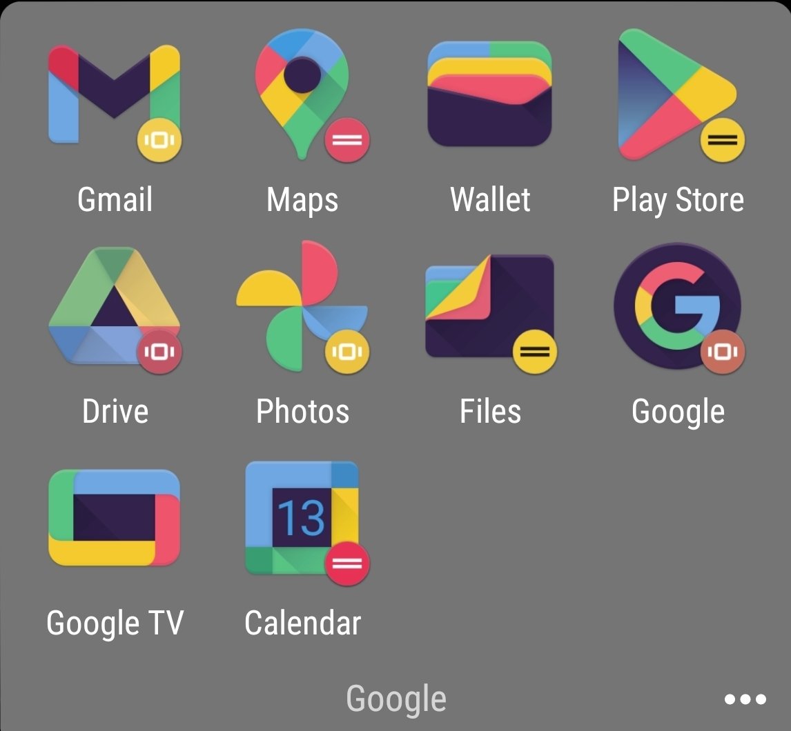
Although the icons are kinda not minimal with the amount of colors in there, they could have like made one app with one or two colors and the other with different ones
Honestly, its considered a hot-take but I do like minimalistic logos cause they are easier to recognize. Also they tend to better fit with the rest of the UI and products.
Counterpoint is the bullshit Google did with all their icons. Same exact colors with different shapes makes quick differentiation an actual challenge.
That’s gotta be an icon pack, given the black and the weird colors. Am I wrong? Did they change it since I last used the stock icons?
Although the icons are kinda not minimal with the amount of colors in there, they could have like made one app with one or two colors and the other with different ones
And then they introduced to android a new option that only showed the shape of the icon in two tones. Now they have no colour and are just odd shapes.