

That Firefox logo was simplified, but not oversimplified. Even with a very small icon size you can still tell it’s a fox that is (on?) fire. The Firefox Family logo is oversimplified, just being a swoosh, basically.
well the family logo is supposed to be as simple as possible
I beg to differ. Until now I never noticed the fox in the logo. And even now that I know it’s there I have a hard time finding it. And I’m looking at a version of almost 1cm on my screen.
Well, I suppose it makes sense that it doesn’t apply to everyone, but my guess is that the majority can still see the fox.
Either way, the simplification of modern logos is a necessity, because they are used in small UI elements, often even appearing monochrome. At which point they still need to be recognizable. Whether they are simplified in a good or bad way, is subjective though.
Never forget what they took from us

I liked this so much more! It was cute and charming.
The new logo looks so office neutral/corporate friendly.
I used to not like the new Firefox logo when it first came out, but by now, I couldn’t do with the old one, it looks so much… And I bet if they changed it back, it would take me 2 months max to switch opinions right back.
At some point I have to accept, I’m just an ape of habit.
Honestly, its considered a hot-take but I do like minimalistic logos cause they are easier to recognize. Also they tend to better fit with the rest of the UI and products.
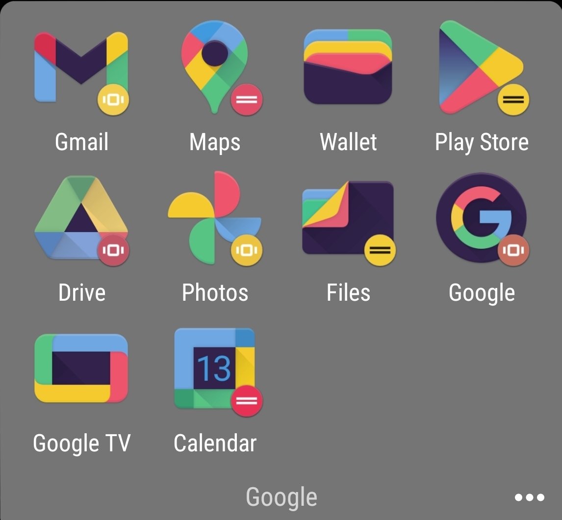
Counterpoint is the bullshit Google did with all their icons. Same exact colors with different shapes makes quick differentiation an actual challenge.
That’s gotta be an icon pack, given the black and the weird colors. Am I wrong? Did they change it since I last used the stock icons?
Although the icons are kinda not minimal with the amount of colors in there, they could have like made one app with one or two colors and the other with different ones
And then they introduced to android a new option that only showed the shape of the icon in two tones. Now they have no colour and are just odd shapes.
The Reddit one looks like if they made a mobile game that’s just another Candy Crush clone.
The new reddit logo is pretty awful but both Firefox logos are fine IMO. They are both pretty well done, just in different styles.
Yup, the design for Firefox’s logo is just a million times better than reddit’s, simplification arguments aside. FF just did a much better job.
I like both the firefoxes. They’re good boys!
I also like the old alien. I’m not someone who generally gets upset when companies introduce a new logo, but the new alien is just nightmare fuel. Get away!!
If they didn’t change the firefox logo, it’d definitely look extremely dated today though
Label the whole picture as “Never happy about anything”
All of these logos look fine.
OP: „I don’t like change.“
the new ff logo makes me feel like i need glasses.
the new reddit logo make me feel like i needed glasses.I like the new Firefox logo though. Except little foxy needs it’s paw back.
Firefox logo looks like shit but so do material design in general. Everything for toddlers and Karens.
I mean, idk. In my opinion both new icons are better. The old Reddit icon looks flat, empty and unprofessional next to new one to my eyes. Not that I really care since Reddit is dead to me.
Let’s talk about this stupid “Let’s put a useless white background under our icons” trend.
Be honest, which looks better?


Oh hey it’s the maps logo, or is that the calendar logo? Nah it’s the files logo. I guess it could be the photos logo…
Really great when I’m trying to find something in a hurry.


